badges labels
Choose from the badge shape gallery
Learn how to choose from the badge shape gallery with a safe Juniper & Trail example, shopper impact, options, and recovery checks. The gallery contains the supported text-badge silhouettes. Shape affects available text space, so preview the final variable values rather than only the placeholder.
Before you begin
- Enable storefront rendering and identify the product-card layouts to test
- Choose text or image artwork
- Prepare Normal, Low stock, and Sold out messaging when stages are used
Keep the campaign in Draft while you verify the configuration. Use a private storefront window where the guide changes shopper-facing behavior.
Step-by-step setup
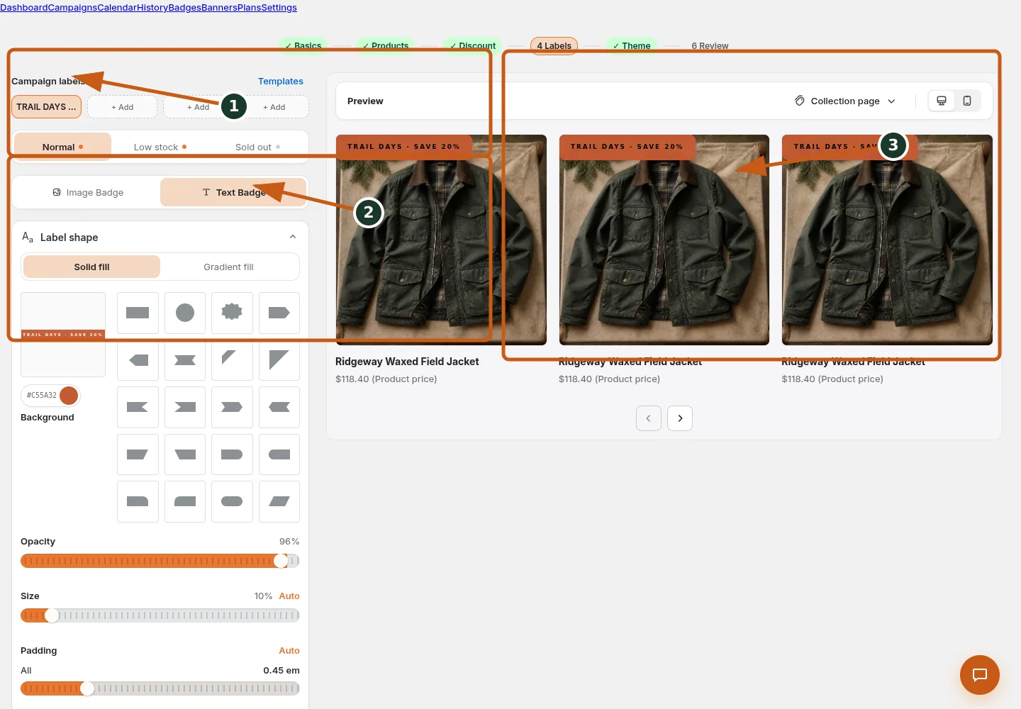
Set the campaign label and add or reorder label slots.
Choose the text badge shape, colors, opacity, size, and padding.
Check badge placement and appearance on the product-card preview.
- Choose Text badge and open Label shape.
- Compare rectangle, circle, rounded, diagonal, triangle, ribbon, star/starburst, cut-corner, slant, pill/capsule, chevron, pentagon, and parallelogram families.
- Choose a shape with enough interior space for resolved Content.
- Set Solid or Gradient fill and shape-appropriate size/offset controls.
- Preview at all intended positions and mobile card sizes.
The gallery contains the supported text-badge silhouettes. Shape affects available text space, so preview the final variable values rather than only the placeholder.
Juniper & Trail example
Juniper & Trail applies choose from the badge shape gallery to the Ridgeway Waxed Field Jacket. The team checks a bright lifestyle image, a dark pack shot, collection cards, and the product page. The documentation fixture uses realistic products, inventory states, variants, collections, and protected exclusions so the preview exercises the same decisions as a merchant catalog.
What shoppers will see
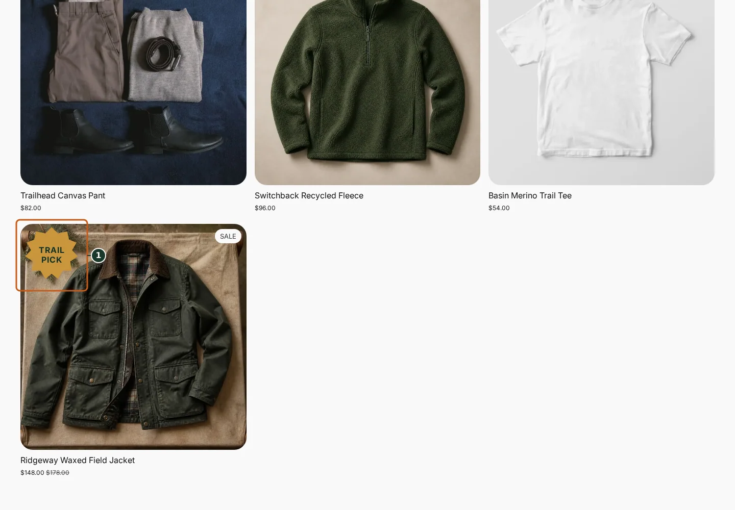
Confirm the campaign announcement and Shop call to action at the top of the store.
Check the badge and adjusted pricing on an eligible product card.
Compare another product card to verify consistent campaign treatment.
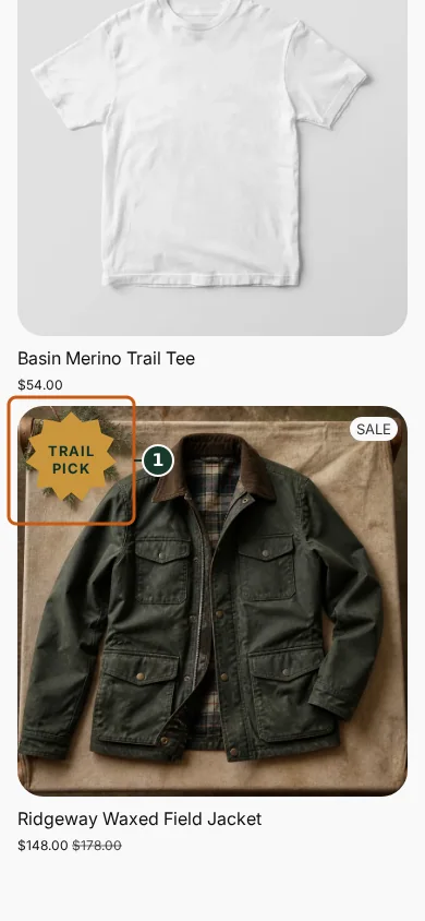
Confirm the campaign announcement and Shop call to action fit the mobile header.
Check that the badge remains readable on the mobile product card.
Scroll through additional products to verify the collection layout stays usable.
The badge overlays eligible product media. Its final size and crop depend on the theme's product-card and media containers. Check the relevant result from product through cart where applicable. For shopper-facing work, compare desktop and mobile and verify both an eligible and an ineligible item.
Common mistakes and troubleshooting
- Acting on the wrong shop. Confirm the Shopify store and campaign before following Choose from the badge shape gallery.
- Trusting a stale preview. Refresh after catalog, schedule, discount, theme, locale, or market changes.
- Repeating a background command. Read status and History first; retry only when Badgy presents a recoverable failure.
- Checking only one viewport. Verify desktop and mobile in a private storefront window.
If the status reports revoked authorization, reconnect Shopify before retrying. If the result still differs from the preview, preserve the campaign ID and approximate time, then open support from this identified shop. Never send customer data, access tokens, or full catalog exports in feedback.
Related guides
Options reference
| Option | Use it when | Consequence | | --- | --- | --- | | Regular | Rectangle, rounded, circle, capsule | Most text space | | Directional | Diagonal, slant, chevron, pentagon | Orientation affects placement | | Corner | Triangles and cut corners | Designed for matching corners | | Decorative | Ribbon, star, starburst | Use shorter copy |
Badgy behavior in this guide is reviewed against the repository's shipped UI, service rules, and feature design documents. Shopify-owned theme, Markets, Flow, billing, and discount behavior can also depend on the store's Shopify configuration; consult the Shopify Help Center for that platform configuration.