banners countdowns
Style a banner background
Learn how to style a banner background with a safe Juniper & Trail example, shopper impact, options, and recovery checks. Choose solid color, gradient, or supported image treatment with sufficient text and control contrast. Check crop, focal point, and overlay at narrow mobile widths.
Before you begin
- Enable the Badgy theme app embed
- Write concise campaign copy and a valid destination
- Plan mobile and desktop evidence
Keep the campaign in Draft while you verify the configuration. Use a private storefront window where the guide changes shopper-facing behavior.
Step-by-step setup
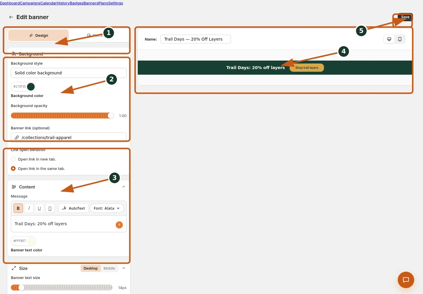
Switch between banner design and storefront placement controls.
Set the background style, color, opacity, and optional image.
Enter and format banner content, text color, and responsive size.
Inspect the live banner preview at desktop or mobile width.
Save the banner after its preview and placement are verified.
- Choose the banner Background style offered: solid color, gradient, or image.
- For gradient, set start/end colors and angle; for image, set URL/upload and fit.
- Adjust background color/opacity where applicable.
- Set text/button colors with readable contrast.
- Preview image crop and focal point at desktop and narrow mobile widths.
Choose solid color, gradient, or supported image treatment with sufficient text and control contrast. Check crop, focal point, and overlay at narrow mobile widths.
Juniper & Trail example
Juniper & Trail uses style a banner background for its Weekend Trail Kit offer. Copy is tested at desktop and mobile widths on an included home page and a direct product page. The documentation fixture uses realistic products, inventory states, variants, collections, and protected exclusions so the preview exercises the same decisions as a merchant catalog.
What shoppers will see
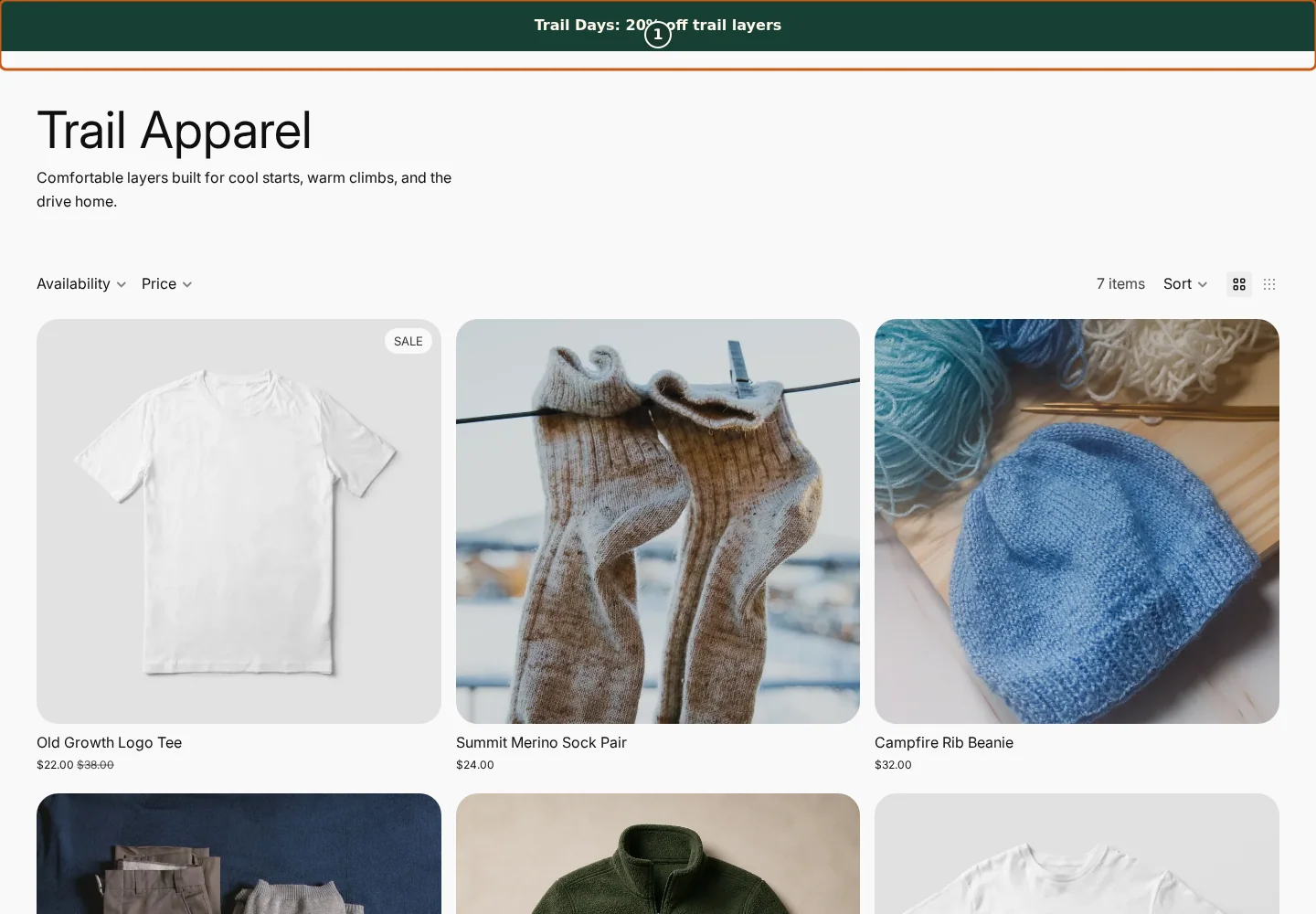
Confirm the campaign announcement and Shop call to action at the top of the store.
Check the badge and adjusted pricing on an eligible product card.
Compare another product card to verify consistent campaign treatment.
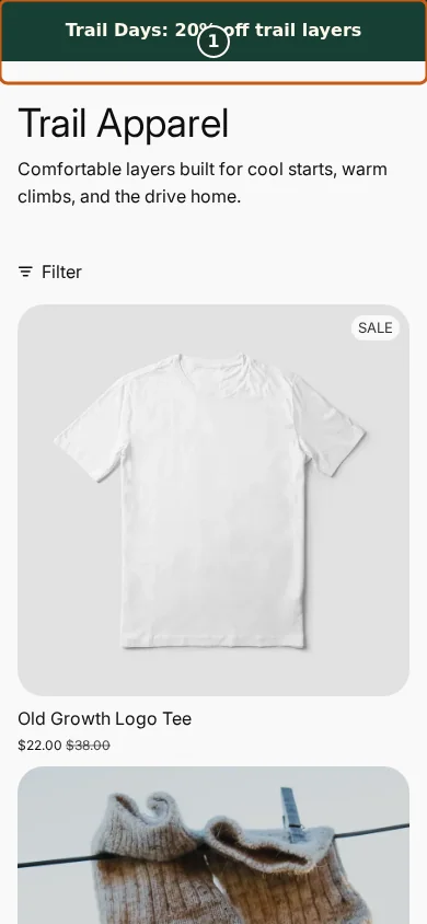
Confirm the campaign announcement and Shop call to action fit the mobile header.
Check that the badge remains readable on the mobile product card.
Scroll through additional products to verify the collection layout stays usable.
The banner renders only on eligible pages while its campaign and visibility rules allow it; the mobile layout may stack content that is inline on desktop. Check the relevant result from product through cart where applicable. For shopper-facing work, compare desktop and mobile and verify both an eligible and an ineligible item.
Common mistakes and troubleshooting
- Acting on the wrong shop. Confirm the Shopify store and campaign before following Style a banner background.
- Trusting a stale preview. Refresh after catalog, schedule, discount, theme, locale, or market changes.
- Repeating a background command. Read status and History first; retry only when Badgy presents a recoverable failure.
- Checking only one viewport. Verify desktop and mobile in a private storefront window.
If the status reports revoked authorization, reconnect Shopify before retrying. If the result still differs from the preview, preserve the campaign ID and approximate time, then open support from this identified shop. Never send customer data, access tokens, or full catalog exports in feedback.
Related guides
Options reference
| Option | Use it when | Consequence | | --- | --- | --- | | Solid | Reliable brand field | Simplest contrast | | Gradient | Two-color depth | Angle changes composition | | Image | Lifestyle/brand art | Fit and mobile crop matter | | Opacity | Balance image and text | Must retain contrast |
Badgy behavior in this guide is reviewed against the repository's shipped UI, service rules, and feature design documents. Shopify-owned theme, Markets, Flow, billing, and discount behavior can also depend on the store's Shopify configuration; consult the Shopify Help Center for that platform configuration.